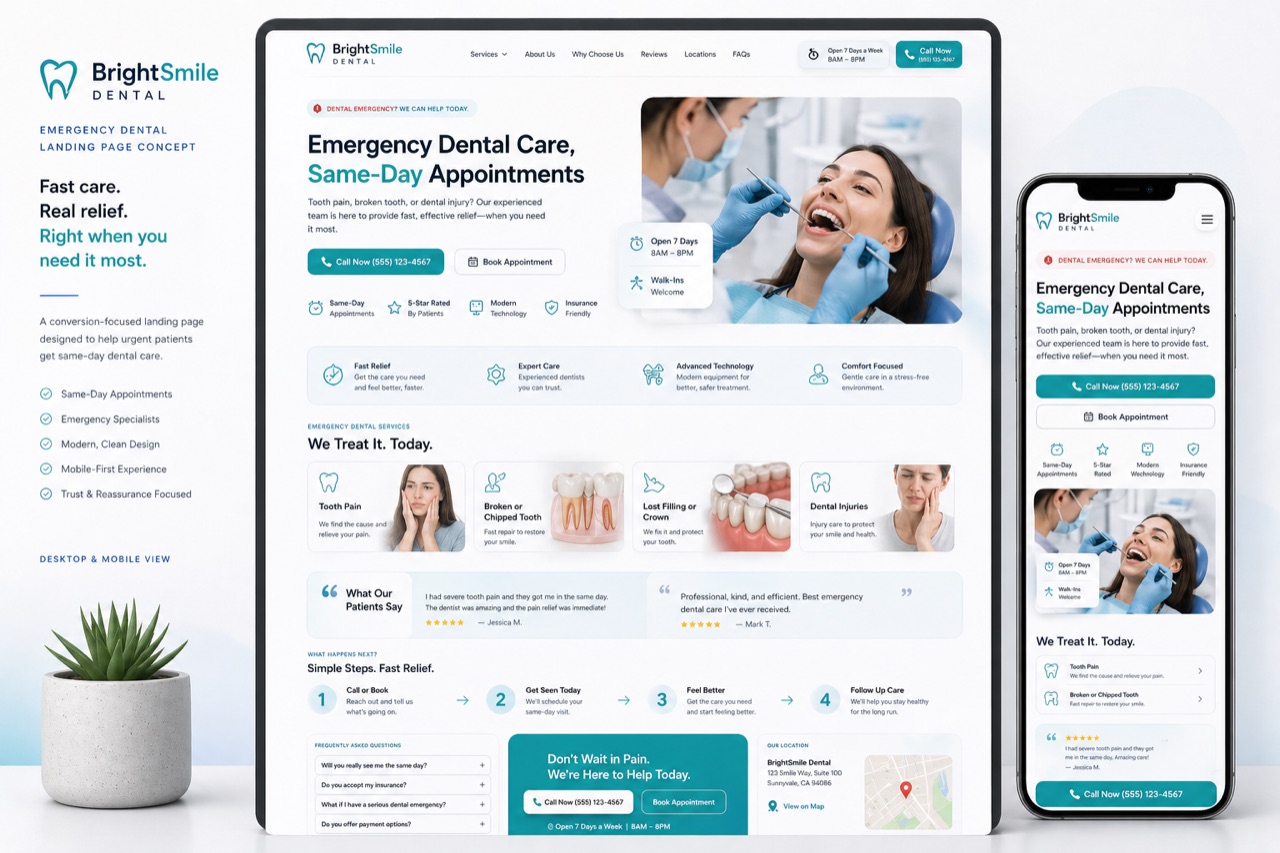
Website Design Concepts | Onyxarro
Services Work Concepts Blog About Free audit →
Portfolio Concepts

Conversion-Focused Website Concepts

A collection of strategic homepage and landing page concepts showing how Onyxarro approaches clarity, trust, visual hierarchy, and lead generation across different industries.

Request a Free Website Audit View Concepts

These are concept projects created to demonstrate design direction, structure, and conversion thinking. They are not presented as client case studies or completed client work.

We design websites with one goal in mind: helping visitors understand, trust, and take action.

These concept projects show how Onyxarro approaches different industries, from B2B and professional services to ecommerce, healthcare, trades, fitness, and SaaS.

Each concept is built around clear messaging, strong visual hierarchy, mobile-first structure, trust-building sections, and conversion-focused calls to action.

Ten Industries · Ten Concepts

Concept projects, built around conversion.

Each card opens an inline breakdown — the business challenge, the conversion goal, the key sections, and the thinking behind the layout.

Center.Gifts concept website design by Onyxarro
Center.Gifts
B2B Custom Products
Concept Project B2B Custom Products

Center.Gifts

Bulk Order Homepage Concept

A B2B homepage concept for a custom product business offering engraving, embroidery, garment printing, and graphic design for bulk buyers.

Bulk quote CTAService clarityPortfolio proofSimple lead flow

Overview

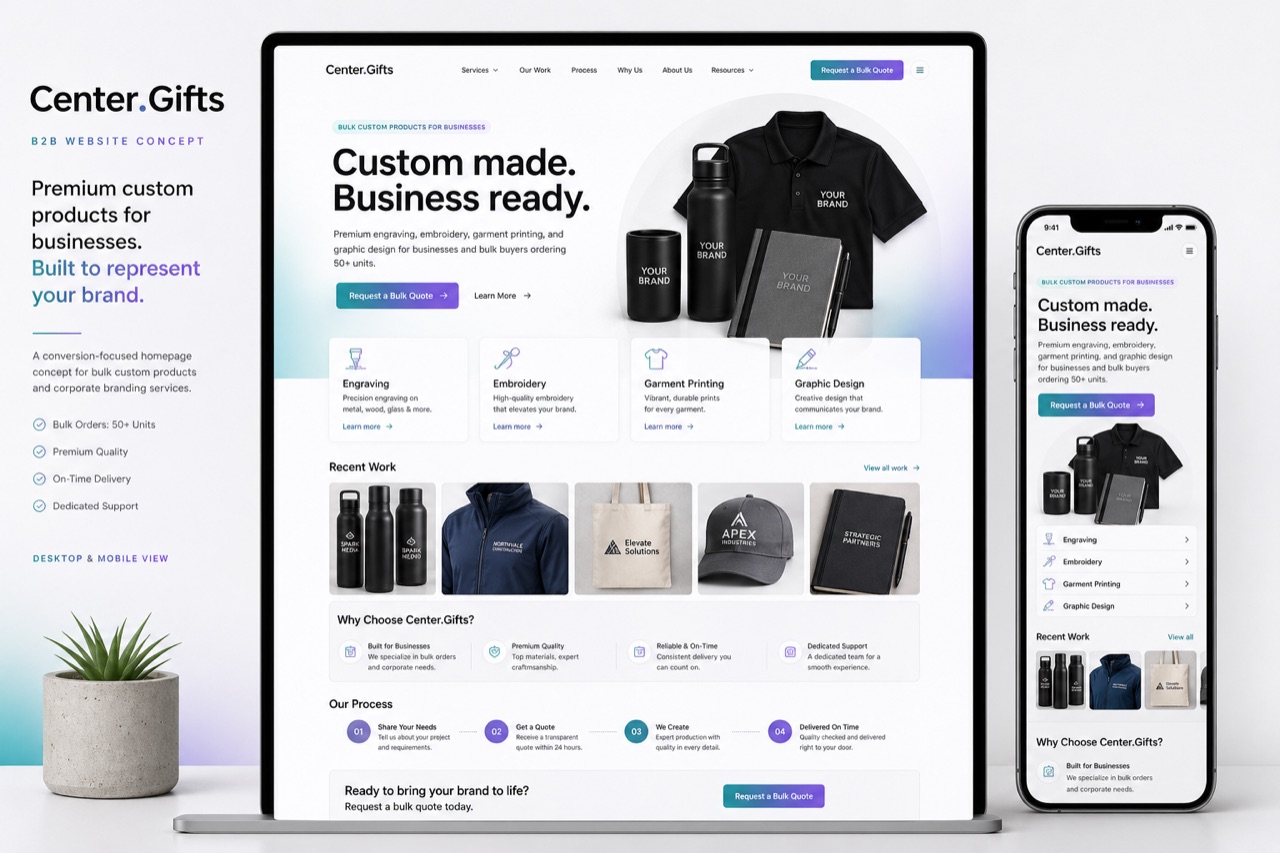
A homepage concept for a B2B custom product studio that handles bulk orders across engraving, embroidery, garment printing, and graphic design. The page is structured to filter serious bulk buyers from one-off shoppers and route them straight to a quote.

Business challenge

B2B buyers need to understand four service capabilities at once, see proof of past bulk work, and request a custom quote without scrolling through a consumer-style storefront.

Conversion goal

Drive bulk quote requests from procurement managers, brand teams, and event coordinators.

Key sections included

  • Hero with a clear bulk-order positioning line and primary "Request a bulk quote" CTA
  • Four service cards: engraving, embroidery, garment printing, graphic design
  • Portfolio strip showing past bulk-run examples
  • How it works — three-step quote-to-delivery flow
  • Use cases by industry: corporate, hospitality, sports, events
  • Inline quote form with order-volume and lead-time fields
  • FAQ section covering minimums, lead times, and file formats

Conversion thinking

The hero CTA is bulk-quote-first, not browse-first. Service capability is shown above the fold so a procurement buyer doesn't need to dig. Portfolio proof comes before the form so the form feels earned, not premature.

Want a website designed with this level of strategy?

Request a Free Website Audit →
BrightSmile Dental concept website design by Onyxarro
BrightSmile Dental
Dental · Healthcare
Concept Project Dental / Healthcare

BrightSmile Dental

Emergency Dental Landing Page Concept

A mobile-first landing page concept designed around urgency, reassurance, and fast appointment enquiries for emergency dental patients.

Same-day CTATrust signalsPatient reassuranceMobile booking flow

Overview

A mobile-first emergency dental landing page concept. Built for visitors searching with a problem — pain, broken tooth, or after-hours injury — who need to book quickly without reading a clinic homepage.

Business challenge

Emergency dental patients arrive on a phone, in pain, with low patience for navigation. The page has to confirm same-day availability, reassure them, and get them to call or book within seconds.

Conversion goal

Drive emergency appointment bookings and direct phone enquiries on mobile.

Key sections included

  • Hero with same-day availability headline and tap-to-call button
  • Reassurance band: "What to do right now" with three calming steps
  • Treatments covered: pain relief, breakages, swelling, after-hours care
  • Trust signals: registration, years practising, patient review snippets
  • Sticky bottom-bar booking CTA on mobile
  • Location, parking, and after-hours map block
  • Mini FAQ covering cost expectations and what to bring

Conversion thinking

Two CTAs run parallel — call and book — because anxious patients prefer voice. Reassurance is layered before clinical information so the visitor feels handled, not sold to. Trust signals sit close to the booking moment, not in a footer.

Want a website designed with this level of strategy?

Request a Free Website Audit →
Northline Contractors concept website design by Onyxarro
Northline Contractors
Contractors · Trades
Concept Project Contractors / Trades

Northline Contractors

Quote-Focused Contractor Homepage Concept

A contractor homepage concept designed to help service businesses generate quote requests through project proof, reviews, and clear service positioning.

Request quote CTAProject galleryReviews and trustService area clarity

Overview

A contractor homepage concept structured around a single conversion: getting a qualified quote request. Built to look premium without losing the practical, jobsite-tested feel a tradie's homepage needs.

Business challenge

Most trades sites win — or lose — on price. This concept gives a contractor the visual credibility to win on trust, with proof and clarity that justify a higher quote.

Conversion goal

Drive quote requests for residential and commercial work in defined service areas.

Key sections included

  • Hero with primary service line and "Request a quote" CTA
  • Services grid with clear scope and rough lead times
  • Recent projects gallery — before / after where it tells a story
  • Reviews block with named clients and project context
  • Service area map with suburb list
  • Quote form with project type, address, and timeline fields
  • Licensing, insurance, and accreditation badges

Conversion thinking

Project proof sits before the form because tradies are bought on past work, not adjectives. Service area is explicit so the form fills with qualified, in-territory leads instead of tyre-kickers from out of region.

Want a website designed with this level of strategy?

Request a Free Website Audit →
Aurea Bottle Co. concept website design by Onyxarro
Aurea Bottle Co.
Ecommerce · Shopify
Concept Project Ecommerce / Shopify

Aurea Bottle Co.

Product Landing Page Concept

A premium Shopify-style product landing page concept focused on product trust, benefits, reviews, and a clear buying path.

Product heroSocial proofFeature hierarchyPurchase CTA flow

Overview

A premium product landing page concept designed in the Shopify mould but tuned for a single hero product. Editorial product imagery, calm spec hierarchy, and a consistent path to purchase from any scroll depth.

Business challenge

A premium DTC bottle brand has to justify its price against generic alternatives. The page needs to communicate quality, build trust quickly, and make the purchase decision feel obvious.

Conversion goal

Drive add-to-cart and checkout completion on a single hero product.

Key sections included

  • Editorial product hero with sticky add-to-cart on desktop
  • Benefit strip — three reasons this product, in plain language
  • Feature breakdown with annotated product imagery
  • Reviews and ratings block with photo reviews
  • Comparison row vs typical alternatives
  • Care, warranty, and shipping reassurance band
  • FAQ and a final purchase CTA with bundle option

Conversion thinking

The sticky add-to-cart removes the "scroll back" friction premium DTC pages create. Reviews appear before the second CTA so the second click feels validated, not pushed.

Want a website designed with this level of strategy?

Request a Free Website Audit →
Maven Advisory concept website design by Onyxarro
Maven Advisory
Consultants · Coaches
Concept Project Consultants / Coaches

Maven Advisory

Discovery Call Landing Page Concept

A consultant landing page concept designed to communicate authority, clarify the offer, and drive discovery call bookings.

Clear positioningAuthority proofOffer breakdownBooking CTA

Overview

A consultant landing page concept built for one job: convert qualified visitors into booked discovery calls. Tight positioning, weighted proof, and a single primary action throughout.

Business challenge

Independent consultants need to communicate specific expertise without slipping into generic "trusted advisor" copy that signals nothing. The page has to position the consultant precisely, fast.

Conversion goal

Drive discovery call bookings via an embedded scheduling block.

Key sections included

  • Hero with a sharp positioning line — who they help and what changes
  • "Who this is for" section to let visitors self-qualify
  • Offer breakdown with engagement structure and outcomes
  • Authority proof: speaking, publications, prior roles, frameworks
  • Process section: discovery call → scope → engagement
  • Embedded scheduler with timezone awareness
  • FAQ on fees, scope, and what to prepare for the call

Conversion thinking

The "who this is for" block is honest about fit, which paradoxically lifts call quality. Authority is laid out as evidence, not adjectives — the visitor decides who the consultant is from facts, not adjectives.

Want a website designed with this level of strategy?

Request a Free Website Audit →
FlowPilot concept website design by Onyxarro
FlowPilot
SaaS · Apps
Concept Project SaaS / Apps

FlowPilot

Demo-Focused SaaS Landing Page Concept

A SaaS landing page concept designed to explain the product quickly, showcase features, and drive demo or trial signups.

Product UI previewFeature cardsDemo CTASocial proof

Overview

A SaaS landing page concept structured for fast comprehension. Product UI lives in the hero, three core jobs are explained on first scroll, and the entire page funnels toward a demo or trial.

Business challenge

SaaS visitors decide in seconds whether a product is worth a demo. The page needs to show the product, not just describe it, and translate features into outcomes the buyer recognises.

Conversion goal

Drive demo bookings and free trial signups.

Key sections included

  • Hero with one-line value prop, a product UI preview, and dual CTAs (demo / trial)
  • Three core jobs the product handles, with screenshots
  • Feature cards grouped by user role
  • Logo bar of representative customers or integrations
  • Pricing band with plan summary and "compare plans" link
  • Trust block: security posture, uptime, and support
  • Final CTA with sample onboarding timeline

Conversion thinking

Showing the product in the hero collapses the "what does this look like?" question that kills SaaS conversion. Feature copy is anchored to the user's job, not the engineering team's terminology.

Want a website designed with this level of strategy?

Request a Free Website Audit →
Clearstone Accounting concept website design by Onyxarro
Clearstone Accounting
Accounting · Finance
Concept Project Accounting / Finance

Clearstone Accounting

Trust-Focused Accounting Homepage Concept

A calm, structured accounting homepage concept built around credibility, service clarity, and discovery call enquiries.

Calm credibilityService clarityTrust-focused layoutConsultation CTA

Overview

An accounting firm homepage concept built for the kind of small-business owner who is choosing between three firms and reading every "About" page. Calm, structured, and quietly confident — built to feel like a firm worth a consultation.

Business challenge

Accounting firms tend to look identical online. The concept differentiates through structure and tone rather than visuals — clarity itself becomes the brand asset.

Conversion goal

Drive consultation requests from small-business owners and contractors evaluating an accountant.

Key sections included

  • Hero with positioning line and "Book a consultation" CTA
  • Services grid: tax, advisory, payroll, year-end accounts
  • Who we work with — sole traders, contractors, small companies
  • Process: onboarding to first reporting cycle
  • Team credentials and registrations
  • Consultation form with current accountant and pain-point fields
  • FAQ covering switching, fees, and software

Conversion thinking

The "switching" objection is handled inline, because most accounting leads are switchers, not first-time clients. Tone is deliberately calm — the page reassures rather than sells.

Want a website designed with this level of strategy?

Request a Free Website Audit →
Harbour & Co Realty concept website design by Onyxarro
Harbour & Co Realty
Real Estate
Concept Project Real Estate

Harbour & Co Realty

Appraisal-Focused Real Estate Homepage Concept

A premium real estate homepage concept designed to generate appraisal requests, property enquiries, and seller leads.

Appraisal CTAFeatured listingsLocal expertiseAgent trust

Overview

A real estate homepage concept built around the highest-value action a brokerage cares about: a free property appraisal request. Featured listings remain prominent, but every section reinforces the path back to a seller conversation.

Business challenge

Real estate sites lean toward listing search and lose the seller. This concept prioritises seller leads while still serving buyers, balancing both audiences without diluting either.

Conversion goal

Drive free appraisal requests from prospective sellers, with secondary listing enquiries.

Key sections included

  • Hero with appraisal CTA and a secondary "Browse listings" link
  • Featured listings band with three to six current properties
  • Local market expertise: suburb pages, recent sales, and median trends
  • Agent profiles with sales record and specialty
  • Vendor process: appraisal → marketing plan → sale
  • Appraisal request form with property and timeframe fields
  • FAQ on commission, marketing spend, and timing

Conversion thinking

The appraisal CTA leads because that's the high-value action. Buyers are still served, but the page never loses sight of the seller — most realty homepages forget who actually pays the commission.

Want a website designed with this level of strategy?

Request a Free Website Audit →
PeakForm Studio concept website design by Onyxarro
PeakForm Studio
Fitness · Gyms
Concept Project Fitness / Gyms

PeakForm Studio

Trial Booking Fitness Homepage Concept

A bold fitness homepage concept designed to drive free trial bookings and membership enquiries through strong visuals and clear CTA flow.

Free trial CTAMembership sectionsTrainer credibilityTransformation proof

Overview

A fitness studio homepage concept that funnels every visitor toward a free trial. Bold typography, strong imagery, and a structure that answers the three questions every potential member asks before they walk in.

Business challenge

Fitness studios compete on community and coaching, but most homepages compete on price. This concept leads with experience and proof, then offers a frictionless trial as the natural next step.

Conversion goal

Drive free trial bookings and membership enquiries.

Key sections included

  • Hero with trial CTA and a session-style image-led layout
  • Class types and weekly schedule overview
  • Trainers section with bios, specialties, and credentials
  • Member transformation stories — text testimonials, no fabricated metrics
  • Membership comparison with plain-language inclusions
  • Trial booking form with class preference and goals
  • Location, parking, and class times block

Conversion thinking

Trial-first beats join-first because almost every gym sale starts with a session, not a contract. Trainer credibility is given prime space because coaching is the real product, not the equipment.

Want a website designed with this level of strategy?

Request a Free Website Audit →
Conversion Strategy

Every concept is built around conversion strategy.

Good design is not just about visuals. Every Onyxarro concept is structured around the questions visitors ask before they take action: What do you do? Why should I trust you? What should I do next?

01

Clear messaging

The first screen tells the visitor what you do, who it's for, and what to do next — in fewer words than most homepages spend on a tagline.

02

Trust-building sections

Credibility lives where the decision happens. Reviews, credentials, and proof appear next to the action, not buried in a footer.

03

Mobile-first structure

Every layout is designed for the small screen first. The phone is the buying surface — the desktop view is the bonus.

04

Strong CTA flow

One primary action. Repeated at every natural decision point. Designed so the visitor never has to think about how to take the next step.

Free · No credit card · 48-hour turnaround

Want your website redesigned with this level of strategy?

Get a free website audit and see where your homepage or landing page could be clearer, stronger, and more conversion-focused.

Concept projects shown above are illustrative only. They are not client case studies and do not represent paid client work.