Quick answer: The best interior designer website design examples all do the same three things well. They lead with large, beautifully shot project photography, they make the designer's style and service area obvious within seconds, and they give one clear path to enquire. A professional build for an interior designer typically ranges from NZD 5,000 to NZD 13,000, and the version that wins clients always treats the portfolio as the product, not a buried gallery.
Interior design is a visual business, so you would think interior design websites would be the most stunning sites online. Most of them are not. A lot of them open with a slow fading slideshow, a soft welcome paragraph about passion and spaces, and a portfolio you have to dig three scrolls to reach. The work is gorgeous. The website hides it.
That gap is the opportunity. When the average site in your niche makes visitors play detective, a clean, fast, well-structured one stands out immediately. You do not need to be flashy. You need to show the rooms, prove you are real, and make booking a consultation easy.
Below are the patterns that separate an interior design site that quietly looks nice from one that actually books work. We will walk through real layout examples, the trust signals that matter, what these sites cost, and the mistakes that cost designers enquiries every week.
Why interior design sites are different
Most service businesses sell with words. A plumber explains what they fix, a lawyer explains who they help. Interior designers sell with proof you can see. The photo of a transformed living room does more persuading in two seconds than three paragraphs of copy ever will.
That changes the priorities. On an interior design site, the imagery is not decoration sitting around the content. The imagery is the content. Everything else (the copy, the layout, the buttons) exists to frame that work and move the visitor toward a conversation.
It also means quality is brutal here. A grainy phone snap of a beautiful room undersells the room. Sharp, well-lit, properly styled photography is the single biggest lever you have. If you take one thing from this article, get your best projects professionally shot before you worry about anything else.
Interior designer website design examples worth copying
Rather than name specific studios, here are the design patterns that consistently work for interior designers. These are the structures behind the interior designer website design examples that actually convert, broken into the styles you can choose between.
Gallery-first homepage
The hero is a single stunning room shot, edge to edge, with the studio name and one button. Scroll once and you are inside a clean grid of projects. No long intro. The work is the welcome. This suits established designers with a strong, consistent style.
Magazine-style layout
Generous white space, large serif headings, and projects presented like spreads in a design magazine. It feels premium and slow in a good way. Best for high-end residential designers charging premium fees, where the site itself signals the price bracket.
Transformation-led
The portfolio is built around side-by-side before and after pairs. Nothing sells a renovation service faster than showing the dated room next to the finished one. This pattern converts well for renovation-focused and staging businesses.
Process and packages upfront
Alongside the portfolio, this layout explains the service tiers clearly: full-service design, e-design, single-room refresh. It reduces tyre-kicker enquiries by setting expectations early. Ideal for designers who offer multiple service levels.
You do not pick one and ignore the rest. Most strong sites blend them: a full-bleed hero, a curated grid, before and after pairs inside each project, and a clear services section. The point is to choose a lead style that matches your clients and your fees, then build everything around it.
What a strong homepage shows first
A visitor decides whether to stay in about three seconds. On an interior design homepage, those three seconds should answer three silent questions: is this beautiful, is this the kind of work I want, and can I tell what to do next.
The homepages that convert tend to share a structure. There is a strong hero image, a single clear line about who the designer helps, an immediate taste of the portfolio, and one obvious button. Everything that can wait (the long bio, the awards, the full service list) waits.
Above-the-fold checklist
- One striking project photo as the hero, not a slow slideshow
- A one-line statement of who you design for and where
- A visible primary button such as Book a consultation
- A hint of the portfolio within the first scroll
- Fast load, even on a phone over mobile data
If you want a deeper look at homepage structure across niches, our guide to website homepage examples breaks down the sections that earn attention and the ones that waste it.
How to present the portfolio
This is where most interior designers either win or lose the client, so it deserves the most care. The instinct is to show everything. Resist it. A tight, curated set of your best work always beats a sprawling archive.
Show fewer projects, but show each one properly. Six to ten standout rooms, each opening into a small case view, does more than forty thumbnails crammed into one page. Curation reads as confidence. A bottomless gallery reads as a stock library you scraped together.
More projects do not make a stronger portfolio. They just give the visitor more places to lose interest before they reach the enquiry button.
Each project case view should be simple: a clear cover image, a few interior shots, ideally a before and after pair, one or two lines on the brief, and the outcome. You are not writing an essay. You are giving enough context that the visitor pictures you doing the same for their home.
The same logic applies whether you are a designer, a photographer presenting a portfolio, or any visual creative. Show the best, frame it well, and make the next step obvious. Our breakdown of website portfolio page examples goes deeper on the grid layouts and case-study structures that hold attention.
Trust signals that win the booking
Beautiful work gets the visitor interested. Trust signals get them to actually enquire. Hiring an interior designer means letting someone into your home and your budget, so people want reassurance that you are real, reliable, and not going to disappear.
None of these need to be loud. A few well-placed proof points throughout the site do the job quietly.
Trust elements that matter most
- Three to five short client reviews with first names and project type
- A real photo of you, not a stock image, on the about page
- A clear service area so local clients know you cover them
- Any press features, awards, or recognised supplier partnerships
- A simple, honest about story explaining how you work
Reviews carry real weight here, especially when they mention the experience of working with you rather than just the result. For more on which proof points actually move people, see our piece on website trust signals examples.
The enquiry flow that converts
You can have the most beautiful portfolio online and still get no enquiries if the path to contact you is buried or clumsy. The enquiry flow is the quiet part of the site that most designers neglect, and it is often where the money leaks out.
Keep it simple. A short form, a visible phone number, and one clear button repeated across the site beats a single contact link hiding in the footer. The fewer fields you ask for, the more people finish. Name, email, suburb, and a sentence about their project is plenty to start a conversation.
It also helps to tell people what happens next. A short line such as We will reply within one business day to arrange your consultation removes the uncertainty that stops people clicking submit. If you want to sharpen the words on your buttons, our website call to action examples guide is a good next read.
Should you show pricing?
This is the most debated question in the interior design niche, and the honest answer is that some pricing usually helps. You do not need a full price list. You do need to set expectations so you are not spending your week on calls with people who thought a full home redesign cost a few hundred dollars.
A fixed consultation fee or a typical project starting point does most of the filtering. It signals your bracket, weeds out the wildly mismatched enquiries, and makes the qualified ones more confident to reach out. Designers who show nothing at all tend to attract a lot of browsers and very few real leads.
Frame it gently. A line such as Consultations start at a fixed fee, with full projects typically starting in a given range respects the visitor's time without locking you into a number for every job.
What an interior designer website costs
A professional interior designer website usually falls between NZD 5,000 and NZD 13,000, depending on how many pages you need and how much custom portfolio presentation is involved. Here is roughly how that breaks down.
| Build type | Typical range (NZD) | Best for |
|---|---|---|
| DIY template | $0 to $500 | Just starting out, very limited portfolio |
| Freelancer build | $1,500 to $4,000 | A simple, decent site if you manage the project |
| Focused portfolio site (agency) | around $5,000 | A polished homepage, portfolio, about, and contact |
| Larger studio site (agency) | $8,000 to $13,000+ | Detailed case studies, e-design booking, journal |
Template builds can work when you are just getting started and only need a basic presence. The trouble starts when you expect a budget site to do the job of a conversion-focused sales asset. The photography presentation, the enquiry flow, and the mobile experience are usually where cheap builds fall short, and those are exactly the parts that win interior design clients.
For a full breakdown across every option, our guide on how much a website costs walks through where the hidden costs hide and what you should actually pay for.
Common mistakes to avoid
Most interior design websites fail for the same handful of reasons. Fix these and you are already ahead of the majority of sites in your area.
- Burying the work. Opening with a slideshow and a welcome paragraph instead of showing rooms immediately.
- Tiny portfolio thumbnails. Forcing visitors to squint at postage-stamp images of work that deserves the full screen.
- Slow load times. Huge unoptimised images that crawl on mobile and lose impatient visitors.
- No clear enquiry path. A single contact link in the footer instead of a repeated, visible button.
- Generic copy. Soft lines about passion and spaces that say nothing about who you help or how.
- Ignoring mobile. A site designed for a big screen that becomes a frustrating scroll on a phone.
If your current site ticks two or three of these boxes, you are losing enquiries you never even see. That is the quiet cost of a website that looks fine but works poorly.
Why mobile decides most enquiries
Most people will find your interior design site on their phone, often from Instagram or a Google search while sitting on the very sofa they want to replace. If the experience there is clumsy, the desktop version barely matters.
Google has used mobile-first indexing for years, which means it primarily looks at the mobile version of your site when deciding how to rank you. You can read the detail in Google's own mobile-first indexing documentation. Speed matters just as much, and Google's guidance on optimising load performance is a useful reference for why heavy, unoptimised images quietly cost you visitors.
For an interior designer, the practical takeaway is simple. Your portfolio images need to be compressed properly so they load fast without losing quality, your buttons need to be easy to tap, and the enquiry form needs to be painless to fill on a small screen. Get the phone experience right and the rest follows.
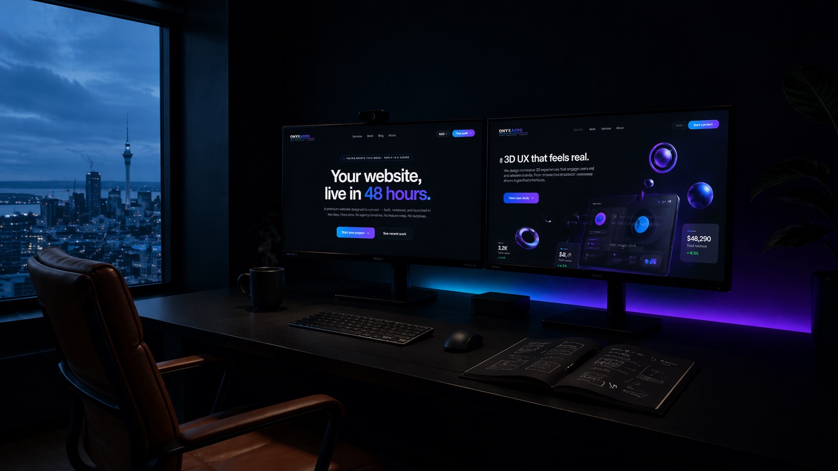
How Onyxarro builds interior design sites
We build websites that treat your portfolio as the product and the enquiry as the goal. For an interior designer, that means a fast, photography-led site with a curated project showcase, honest trust signals, and one clear path to booking a consultation.
A typical interior designer build
- Launch package, from NZD 5,000. Up to 5 pages: a photography-led homepage, a curated portfolio, an about page, a services page, and a contact flow built to convert.
- Growth package, from NZD 8,000. Up to 10 pages, adding detailed project case studies, a journal for Google, and dedicated service pages for e-design or staging.
- Studio package, from NZD 13,000+. Custom-scoped builds with deeper content, advanced portfolio interactions, and booking integrations.
Every build starts with a homepage redesign preview delivered within 48 hours, so you see the direction before committing to the full project.
Not sure where your current site is leaking enquiries? Get a free website audit and we will show you exactly what to fix. If you would rather see the options first, take a look at our website packages. To understand what separates a site that looks nice from one that books work, our guide on what makes a website convert is the natural next step.
The bottom line
The strongest interior designer website design examples are rarely the flashiest. They are the ones that show the work big and early, prove the designer is real and reliable, and make booking a consultation effortless. Your portfolio is the product, so build the whole site to frame it.
Get the photography right, curate hard, add a few honest trust signals, and keep the enquiry path obvious on mobile. Do that, and your site will quietly outperform the prettier ones that hide their best work three scrolls down.