Quick answer: The best electrician website design examples share three habits: they put a tappable phone number on every screen, they prove you are licensed and trusted within seconds, and they make the next step (call or quote) impossible to miss. A clean, lead-focused electrician site typically costs between NZD $5,000 and $13,000 depending on pages and features. Looks matter, but clarity and trust are what actually book the job.
Most electrician websites are quietly losing calls. The problem is rarely that they look ugly. They make a tired customer with a tripped switchboard hunt for a phone number. By the time they find it, they have already tapped the next sparky on the list.
This guide walks through real electrician website design patterns that work, with examples you can copy this week. We will cover layout, trust signals, pricing, mobile, and the difference between a site that looks fine and a site that earns. No jargon, no fluff.
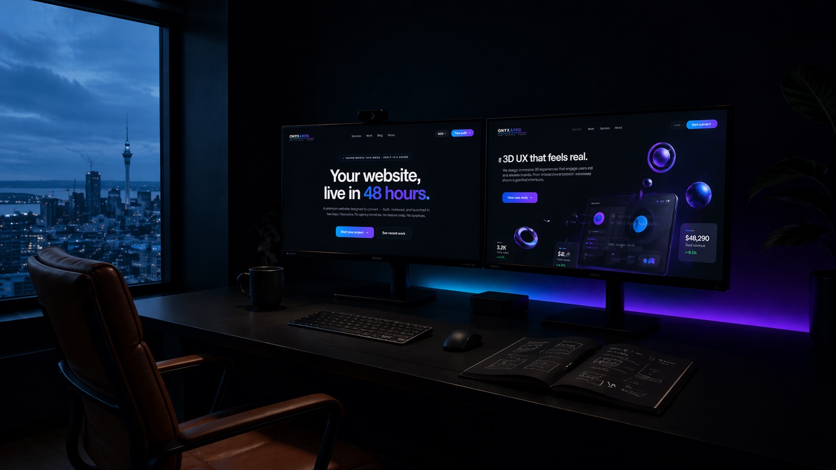
Onyxarro is a young studio, so we are not going to wave fake case studies at you. What follows is the playbook we use when we build for trades, plus honest pricing so you can plan.
What good electrician web design looks like
Strip away the design talk and an electrician website has one job: turn a stranger with an electrical problem into a booked job. Everything on the page either helps that or gets in the way.
The strongest electrician website design examples feel almost boringly clear. You land, you instantly understand what they do, where they work, and how to reach them. The phone number is right there. The reviews are real. The quote button does not hide.
Compare that to the average trade site: a slow stock photo of a lightbulb, a generic "Welcome to our website" line, and a contact form three scrolls down. It is not that those sites are bad looking. They just make the customer do too much work, and customers in a hurry do not.
A customer with no power does not care about your slider animations. They care that they can call you in two taps and trust you will turn up.
So before we look at examples, hold this filter in your head: does this element help someone book faster, or does it just decorate? Good electrician web design is mostly the discipline to cut the decoration.
Electrician website design examples to copy
Here are the recurring patterns we see on electrician websites that actually convert. Think of these as proven building blocks rather than themes to copy pixel for pixel. The job is to steal the structure, not the colours.
Problem-first headline
Instead of "Quality electrical services since 2009", lead with the customer's need: "Licensed electricians in Hastings. Same-day callouts." Pair it with a giant tap-to-call button and you have a hero that books.
Badges above the fold
A thin row right under the hero showing licensed, insured, master electrician membership, and a Google star rating. It answers "can I trust this person" before the customer even scrolls.
Icon grid of real jobs
Switchboard upgrades, EV charger installs, lighting, faults, new builds. Six to nine clear tiles, each linking to a short detail page. People scan for their exact problem, then click.
Reviews with names and suburbs
Three or four short reviews with a first name and a location beat one long paragraph testimonial. Local names make it feel real and nearby, which is exactly what a local customer wants.
Honest price guidance
A simple "Callout from $X" or "Safety inspections from $X" block. You are not committing to a full price list, you are setting expectations and filtering out bargain hunters.
Service area map
A short list or simple map of the towns you cover, plus your hours and licence number. This is quiet SEO gold and it reassures customers you actually work where they live.
You do not need all of these on day one. But the more of them you have, working together, the harder your site works. For a wider view across trades, our tradie website design examples piece covers the same patterns for builders, plumbers, and more.
The homepage formula that books calls
Your homepage carries most of the weight, because it is where ads, Google, and word-of-mouth referrals all land. Get the order right and the rest of the site barely has to try.
Here is the stacking order we use, top to bottom:
- Hero with a problem-first headline and a tap-to-call button. The phone number is visible, not implied.
- Trust strip with licence, insurance, and star rating.
- Services grid so people find their exact job in seconds.
- Why choose us in three short points: fast, tidy, upfront pricing.
- Reviews with names and suburbs.
- Service area so locals know you cover them.
- Final call to action repeating the phone number and quote form.
Notice the phone number appears at the top, the middle, and the bottom. People decide to call at different moments, and you want the button waiting wherever they are when they decide. If you want to dig deeper into the psychology of that flow, what makes a website convert breaks it down further.
Trust signals that close nervous customers
Electrical work scares people a little, and that is good for you. Customers will pay more for someone they trust because the downside of a dodgy job is a fire or a fried appliance. Your website's main task is to remove the fear.
Trust signals every electrician site needs
- Licence number displayed, not just the word "licensed"
- Public liability insurance mentioned plainly
- Master Electricians or relevant trade body membership badge
- Google reviews with a visible star count and link
- Real photos of you and your van, not stock models in clean overalls
- A clear guarantee or workmanship promise
- Response time expectation ("we answer or call back within the hour")
Real photos matter more than electricians expect. A genuine photo of you next to your sign-written van does more for trust than the slickest stock image ever will. Customers are letting a stranger into their home. Show them the stranger.
For a full menu of trust elements with examples, see our guide to website trust signals.
Emergency and 24/7 callout layouts
If you offer emergency or after-hours work, this is your highest-value traffic. Someone with no power at 9pm is not comparing five quotes. They are calling the first electrician who looks legit and available. Make that you.
The pattern that works: a bold, high-contrast emergency band near the top of the homepage with a single message and a single action. Something like "No power? Sparks? Burning smell? Call now, 24/7." plus one giant phone button. No form, no fluff. In a real emergency a form is friction.
A dedicated emergency page also helps you rank and run ads for those urgent searches. Keep it short: the problem, the promise (we answer day and night), the number, and a line about safety. That is enough. Urgency rewards simplicity.
Service and service-area pages
One homepage can only do so much. Individual service pages let you go deep on the jobs you actually want, and they give Google something specific to rank.
Create a focused page for each high-value service: switchboard upgrades, EV charger installation, LED lighting, fault finding, new build wiring, and safety inspections. Each page should answer the obvious questions, show a relevant photo or two, list a price range, and end with the same call to action as the homepage.
Service-area pages are the other quiet win for local electricians. If you cover several towns, a short, genuinely useful page for each one ("Electrician in [town]") helps you show up when locals search by location. The key word is genuinely useful. Do not spin up twenty thin copy-paste pages, that backfires. A handful of real ones beats a swarm of empty ones.
Mobile, speed, and the thumb test
Most electrician website visits happen on a phone, often outdoors, often in a hurry. If your site is slow or fiddly on mobile, you are losing jobs you never knew you had.
Run the thumb test: open your site on your phone and try to call yourself in under five seconds using only your thumb. If you cannot, neither can your customers. The tap-to-call button should be big, obvious, and sticky so it follows the customer as they scroll.
Speed is the other silent killer. Google's own research shows that as page load time climbs from one second to three, the chance a visitor leaves jumps sharply (see web.dev on loading performance). Heavy template themes and giant unoptimised photos are the usual culprits. A fast, lean build pays you back every single visit. Google's page experience guidance is worth a skim if you want the technical side.
Should you show prices?
This one splits the trade. You do not need a full itemised price list, and many jobs genuinely need a quote. But showing nothing makes cautious customers nervous, and nervous customers click away to whoever looks more upfront.
The sweet spot is price guidance. A callout fee, a "from" price on common jobs, and a clear note that bigger work is quoted after a look. This sets expectations, filters out people hunting for the cheapest possible option, and signals confidence. Hiding everything reads as "if you have to ask, you cannot afford it", which is the wrong vibe for a local sparky.
What an electrician website costs
Pricing varies a lot, so here is honest guidance rather than a magic number. A simple lead-focused electrician site sits at the lower end. Add service pages, booking, and custom design and it climbs.
| Option | Typical range (NZD) | Best for |
|---|---|---|
| DIY template (Wix, Squarespace) | $0 to $500 plus your time | Brand new sparky, very tight budget |
| Freelancer build | $1,500 to $4,000 | Basic site, variable quality and support |
| Studio: lead-focused site | $5,000 to $8,000 | Most established electricians wanting more calls |
| Studio: larger custom build | $13,000+ | Multi-town, booking systems, deeper content |
For reference, our own packages start at Launch (NZD $5,000, up to 5 pages), then Growth (NZD $8,000, up to 10 pages), and Studio (NZD $13,000+, custom scoped). Most electricians land in the Launch to Growth range. We dig into the full picture in how much a website costs, including the hidden fees that catch people out.
The cheap option is rarely the cheap option. A template site that books no jobs costs you every lead it fails to catch, which adds up fast for a trade where one switchboard upgrade can be worth thousands.
Common electrician website mistakes
We see the same handful of errors on almost every electrician site we audit. Fix these and you are ahead of most of your competitors.
- Phone number buried. If it is not tappable and visible at the top, you are losing calls.
- Generic stock photos. A model in spotless overalls builds zero trust. Use real photos.
- No reviews. Or reviews hidden on a page nobody visits. Bring them to the homepage.
- Slow load. Heavy themes and huge images quietly kill conversions on mobile.
- Vague services. "Electrical solutions" tells nobody what you do. Name the jobs.
- No service area. Customers want to know you actually cover their town.
- One call to action, three scrolls down. Repeat the call to action top, middle, and bottom.
None of these are hard to fix. They are just easy to miss when you built the site yourself and you already know your own phone number by heart.
How Onyxarro builds electrician sites
We build electrician websites around one question: where is this site going to lose a call, and how do we close that gap? Every layout decision traces back to booking more jobs, not winning a design award.
That means a fast, lean build, a tap-to-call button that never leaves the screen, real trust signals up top, and price guidance that filters out time-wasters. We can have a homepage redesign preview in front of you within 48 hours, so you see the direction before committing to the full build.
A typical electrician site, the Launch way
- Conversion-focused homepage with sticky tap-to-call
- Services overview plus your highest-value job pages
- Trust strip: licence, insurance, reviews, real photos
- Service-area section for the towns you cover
- Quote form and emergency callout band
- Fast, mobile-first build that loads in a blink
Launch starts at NZD $5,000 for up to 5 pages. Need service pages for every town and a booking system? Growth at NZD $8,000 covers up to 10 pages. We will scope it honestly after a quick look at your current site.
The best first step is free. Get a free website audit and we will show you exactly where your current site is leaking calls. Or browse our packages to see what a build includes. We would rather you make an informed call than a rushed one.
The bottom line
The best electrician website design examples are not the flashiest. They are the clearest. A visible phone number, fast load, real trust signals, honest pricing, and a call to action that follows the customer down the page. That combination quietly outbooks prettier sites every day.
Steal the structure, fix the obvious mistakes, and your website starts earning instead of just existing. And if you would rather have someone build it right the first time, that is what we are here for.